Dev · June 16, 2026
Adding a Contact Form to Moshin Media: Turning Visitors Into Real Inquiries
This is a short follow-up to the Moshin Media rebuild.
The first phase was about modernizing the website itself — making it faster, cleaner, and more in line with the quality of work Moshin Media actually produces. This phase was about something more practical: giving the site a real way to turn a curious visitor into an actual inquiry.
What John Asked For
Once the site looked the part, the next gap was obvious.
A polished website is great, but it still needs an easy way for an interested visitor to say “I want to work with you.” John’s request was simple and clear: he wanted a Contact Us form on the site — something a potential client could fill out in a few seconds — and he wanted those messages to land directly in his inbox, just like a normal email.
No new app to check. No separate dashboard to log into. No change to the email setup he already relies on every day. Someone fills out the form on the site, and John gets an email.
What We Added
The Contact page now has a clean “Get in Touch” form. A visitor enters their name, phone number, and email, with an optional spot for any extra notes about what they’re looking for.
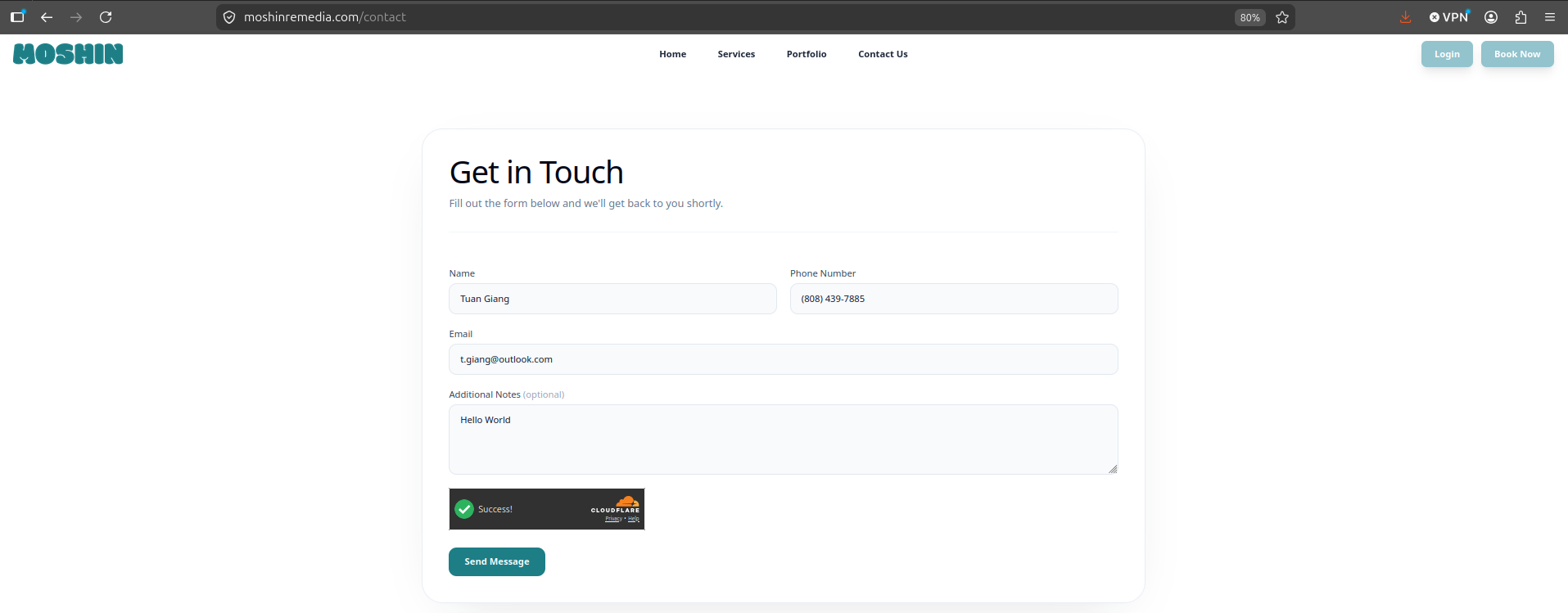
The form is intentionally simple. It asks for just enough to start a real conversation and nothing more. When the visitor hits Send Message, they get an instant confirmation that it went through.
What John Receives
This is the part that matters most to the business. The moment someone submits the form, a clean, easy-to-read email arrives in John’s inbox with everything he needs to follow up.
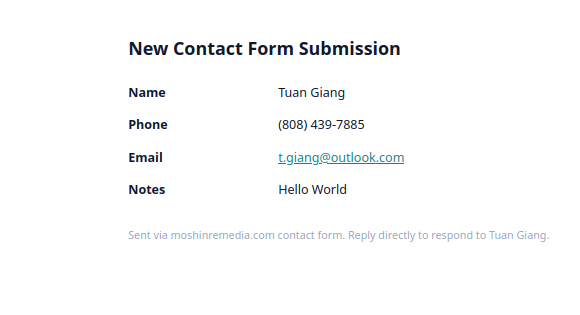
The visitor’s name, phone, email, and notes are all laid out plainly. Best of all, John can simply hit reply and respond directly to the person who reached out — no copying and pasting, no extra steps.
A Few Quiet Details
A contact form sounds simple, and from the visitor’s side it should feel that way. A couple of things were handled behind the scenes to keep it working smoothly:
- It keeps the spam out. Public forms attract junk, so the form quietly screens out bots before anything reaches John’s inbox. Real people don’t notice it; automated spam doesn’t get through.
- It fits the email John already uses. Nothing about his existing mailbox had to change. The messages arrive like any other email, so there’s no new system to learn or maintain.
- It just works on any device. The form behaves the same whether a client is on their laptop or their phone.
Why It Matters
The original rebuild made the site look and feel like the premium brand it represents. This second phase made it useful in a business sense.
A great-looking website earns a visitor’s trust. A contact form is what lets the business act on that trust — it closes the loop between “this looks impressive” and “let’s talk.” Now when someone lands on the site and likes what they see, they’re one short form away from being a real lead in John’s inbox.
That’s the quiet difference between a site that looks good and a site that works for the business behind it.